Thursday, 10 November 2016

Rules of Compositon

                 
  Framing- this is a great example of framing beacuse it frames both the ball going into the net and the boy shooting, also since it a natural frame. I like this photograph because how the emphasis is on the ball, also how the boy is alone, i feel like the photo would have a deeper meaning.

                 
Disrupting pattern - I think this is a great example of dustrupting patterns because building are somthing you see in everyday basis, but you don't really see the patterns or smplicity of the building.
This image really caught my eye beacuse of the variety of lines, how all the main lines are going down but the ones that pop out are going across. 

                   
 Leading Lines - I think this is a excellent example of leading beause the photograph is taken froma diffrent point of view, if it was taken in the front then it would represent patterns but from the side like so, is shows leading lines. I like this photograph beacuse of the contrats between the floor and the ceiling how they are opposite color. The ceiling is plain black and the floor is plain grey, in betwen there is a pattern which really balances the whole picture.

                                                 
 Fill the Frame - I think this is a good example is fill the frame because pet fish are usually small so making it bigger is something new. I like this photo because of the contrast between the bright fish and the drak background.

Wednesday, 9 November 2016

Final Illustrator Logo Assignment

pictographic rough


typographic roughs
combined roughs
combined finals
pictographic finals


typgraphic finals


My company is a clothing brand, the target market are mainly teens. Expression-ate, fierce and bold self assured, is the personality of and style of my company. the main style of my clothing would be very minal, mostly black white and baige colours. 
I choose the tiger because i think it best represents the personality of my company. tigers are very firce they hunt for food, they are feared by many animals and are very bold and strong. 
I chose to make my lines very straight and bold, which shows confiendce, strenght and self assurance. 
   I kept the colors to a minimal to fit the style of my company, i used very little color to be formal and edgy.
I used the square shape to frame my tiger, because it made the logo look very complete and pulled together. Also since my tiger was cut off from the bottom i had to find a way to work around it.
The outter frame is where the eye goes to first, becasue it is the most bold, then it draws into the square twoard the tiger which is a very detailed and thin lines. Also since the frame is the largest of the entire logo then it gets smaller in the inside.
In my logo i used alot of contrast, i used thicker frame on the outter side, and thinner on the inside. I used black and white beause they are opposites and i used the color peach. Beacuse the tiger has curved lines i used straight lines around it. 
Some of the challenges i faced while using illustrator were, the pen tool, filling the colour and layering. I over came these challenges by learning the key board short cuts and organizing my layers.
I learned how to use Adobe Illistrator, how easy it is to make a logo, and how to personalize your work in a way you want. 


Understanding Shutter Speed, Aperture and ISO

This picture was taken with fast shutter speed, you can tell because you can see the movement in the photograph. You can see all the water droplets and every detail.

Image result for pictures with slow shutter speed
This photograph was taken with slow shutter speed,you can tell because of how the train in the background is not clear, its blurry since it moving. If this picture was taken with fast shutter speed it would look like this. the train would be clear like its frozen. Image result for pictures with fast shutter speed subway station


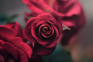
This photograph was taken with shallow depth of field, you can tell becuse the rose is the main focus and its the closest to the camera.


This photo was taken with wide depth of field, you can tell beacuse the focus goes all the way to the end of the picture.

Sunday, 6 November 2016

logo assignment

 The three adjectives i think describe myself would be expression-ate, fierce and bold self assured.
i have not come up with a name for my company yet, but it will be a clothing brand. 


Wednesday, 28 September 2016


This art work was done by Nathlie Bertin

It seems like the medium of this art work is a mix between acrylic and water-color. The objects in this artwork are peoples faces, dogs, horses and wolves and, as it seems, one fish. I don't see many straight lines, most of the lines are wavy or curvy. There are a variety of shapes such as thick and thin and curvy with mostly soft edges. I see soft, smooth and dull textures. The art work mainly consists of warm colors but in the back it seems like some cold colors are peeking through.

The first thing when i look at this artwork i see the lady on the very left, then my eye goes down to the horse on her body and all the way to the bottom of the page back to the middle top. This artwork is asymmetrical is it no symmetrical what so ever. The light however seems to be coming from the front. the darkest part of the art work is the big fish on the left of the piece and around the faces and dogs like kind of an outline.  There is repetition of dogs and faces but they all are different. 

I'm not sure whats happening in the artwork but that's one of the things i like about it. the artist shows nature through the different animal in the picture. Some words that describe this art work would be beauty, strength,mystery,hope,exhaustion,war and peace. 

i think the two theories imitation-ism (imitating nature) and emotionalism. I like this art work because you really have to look to find the diffrent images in the piece. Also the more you look the more you notice and see. i love how each line represents something and it all fits together.
  

Sunday, 25 September 2016

Repetition and Rhythm Assignment

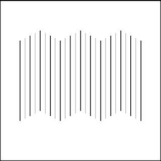
Steady Lines

I created a sense of rhythm in this image by first just making evenly spaced vertical lines that move up and down. It looked to simple to me and I made every other line a bit thicker. All the lines are the same length but are placed some higher than others which creates the illusion that the thinner lines are father and the darker lines are closer. There is also an chevron looking implied live that is horizontal at the edges of the lines.

Dynamic Lines

I originally tried to recreate a pattern similar to the one on the floor but then i started playing with the thickness and where i placed the lines and turn it into this. I think this one is more pleasing to the eye since there is more variations of direction. This one works together more, it looks like the lines connect but if you really look closely none of them do.